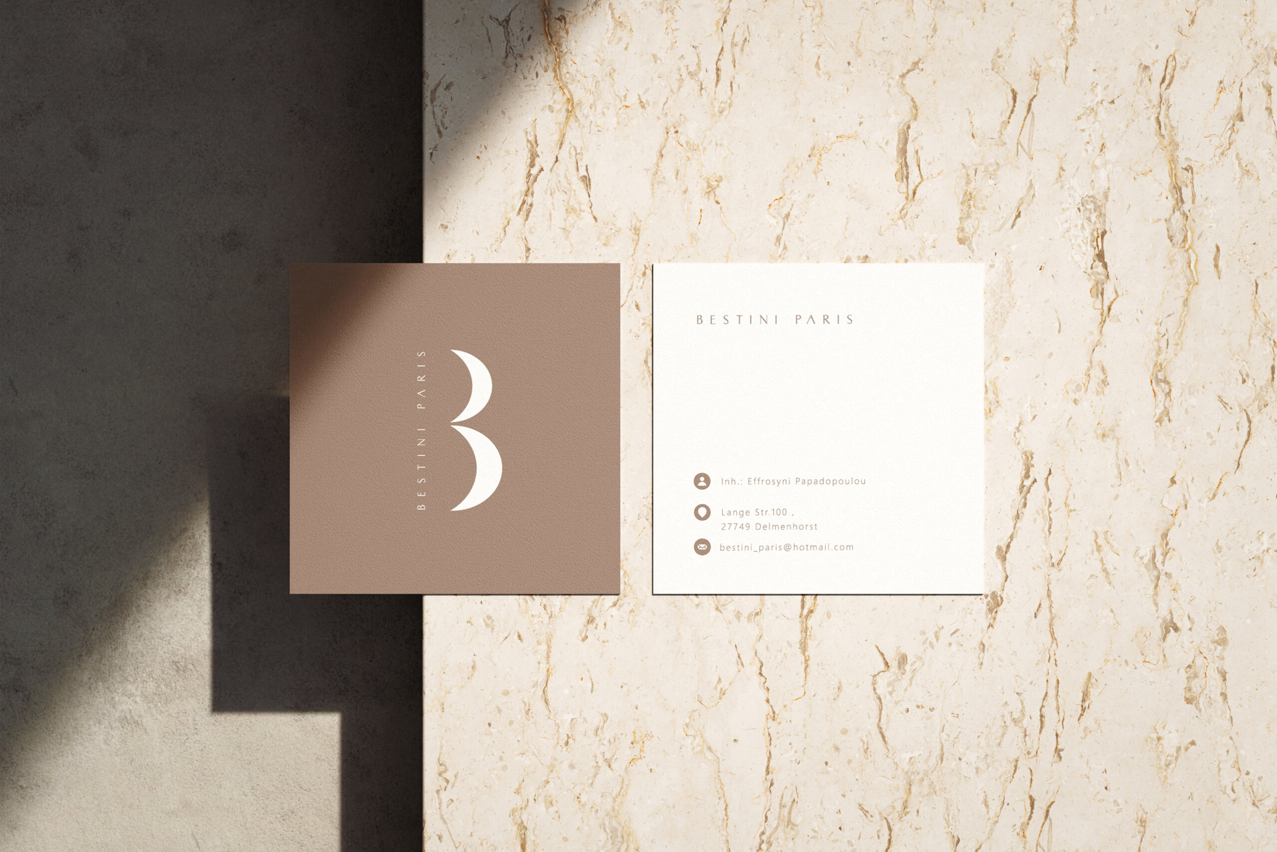
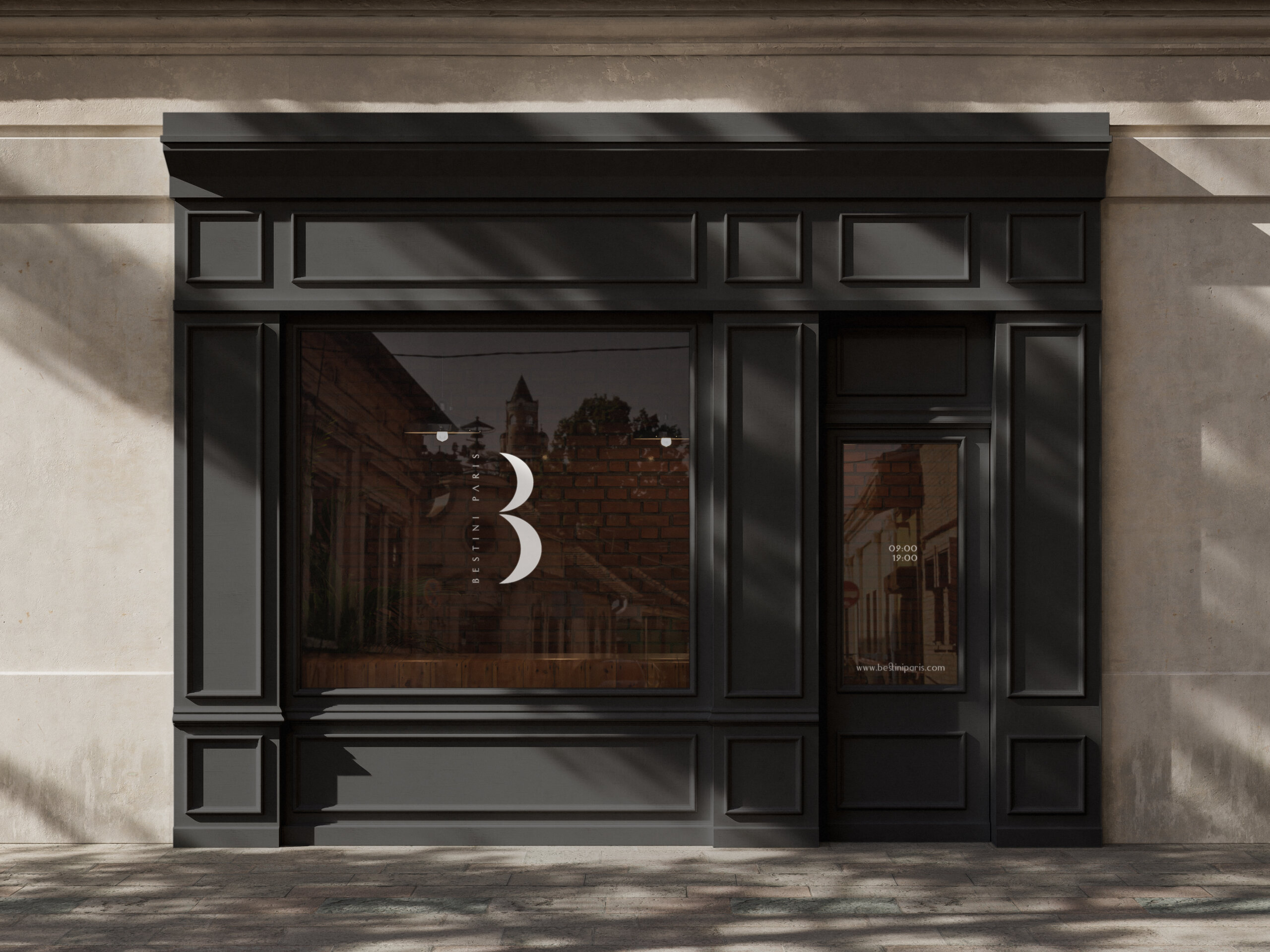
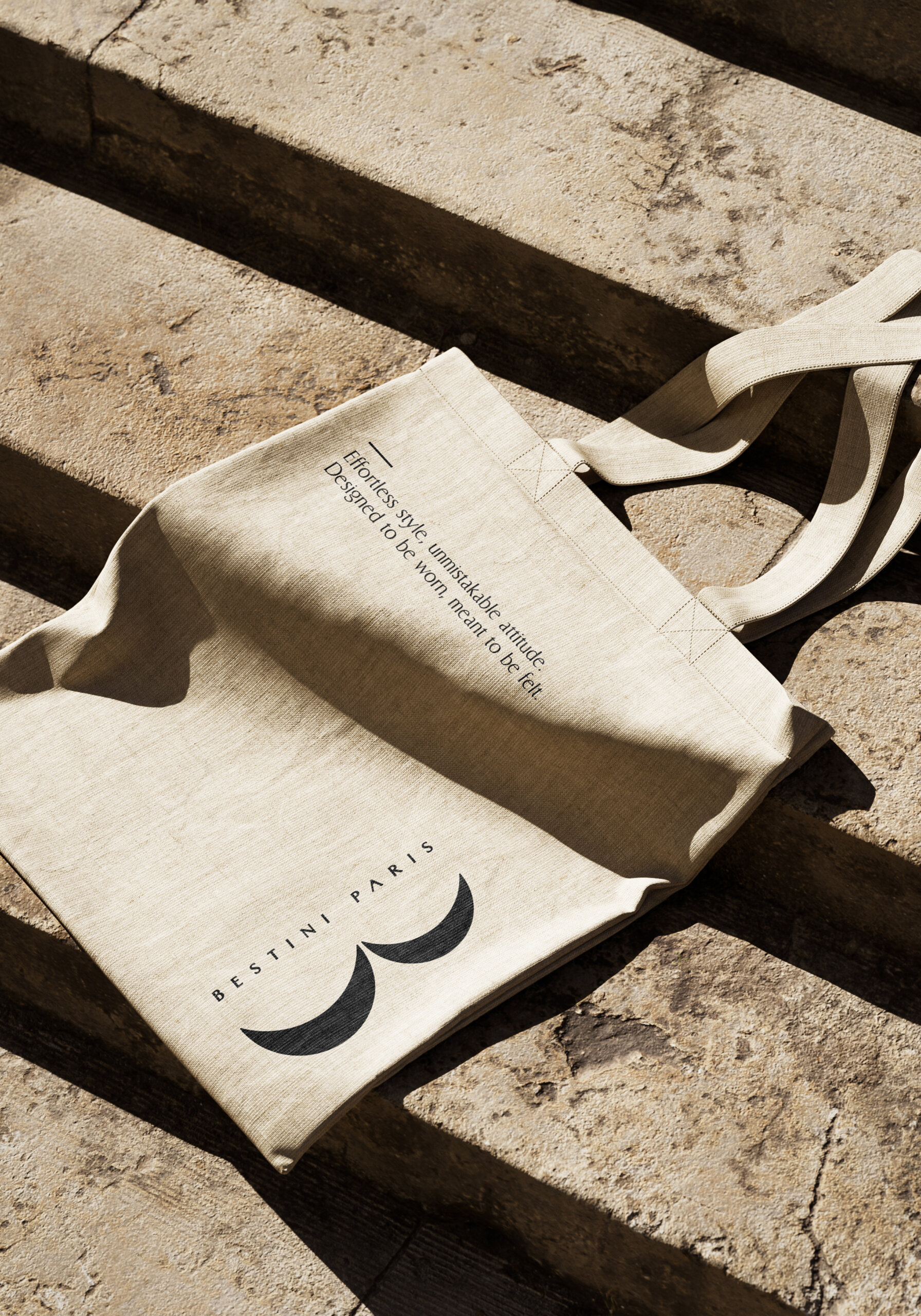
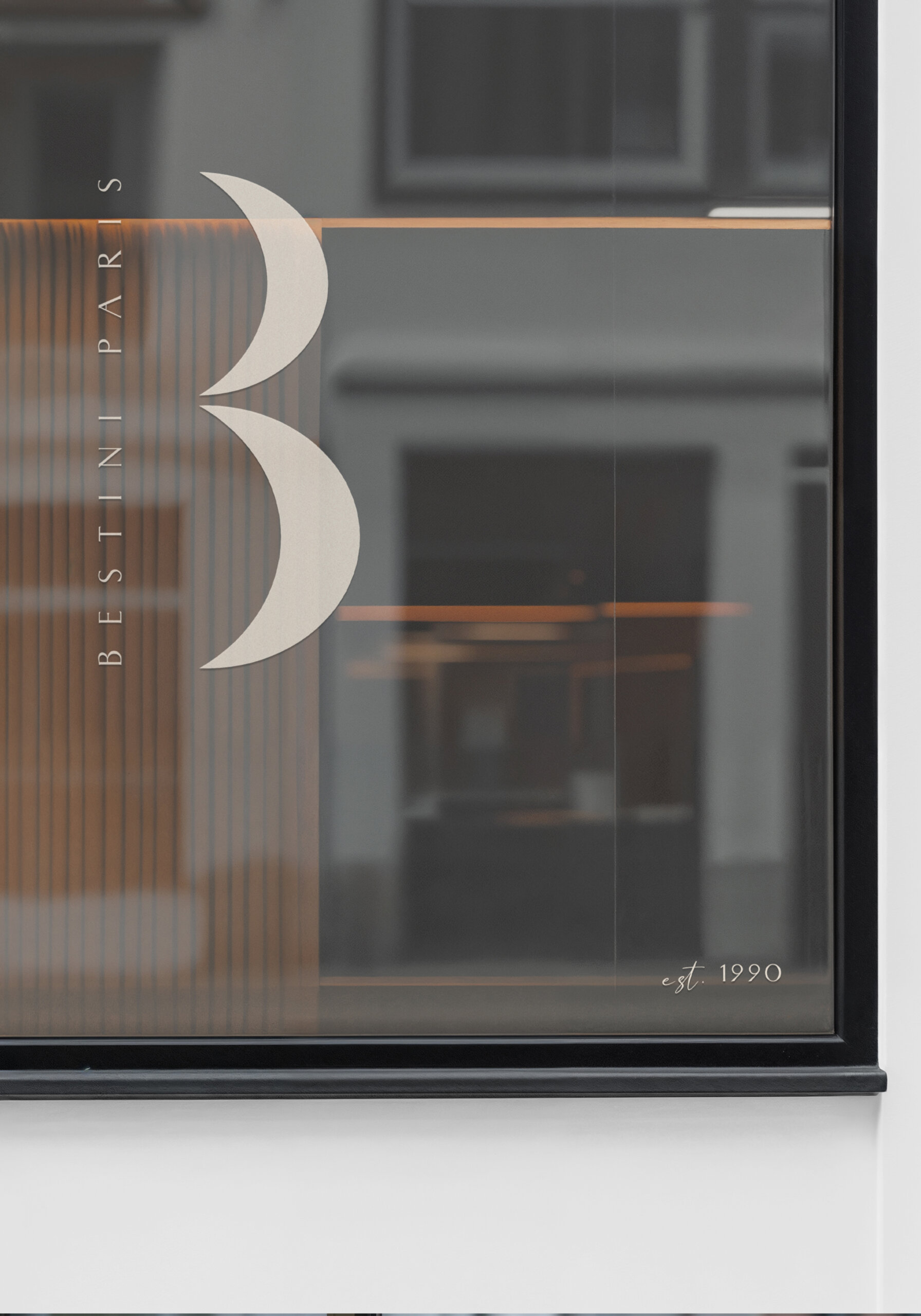
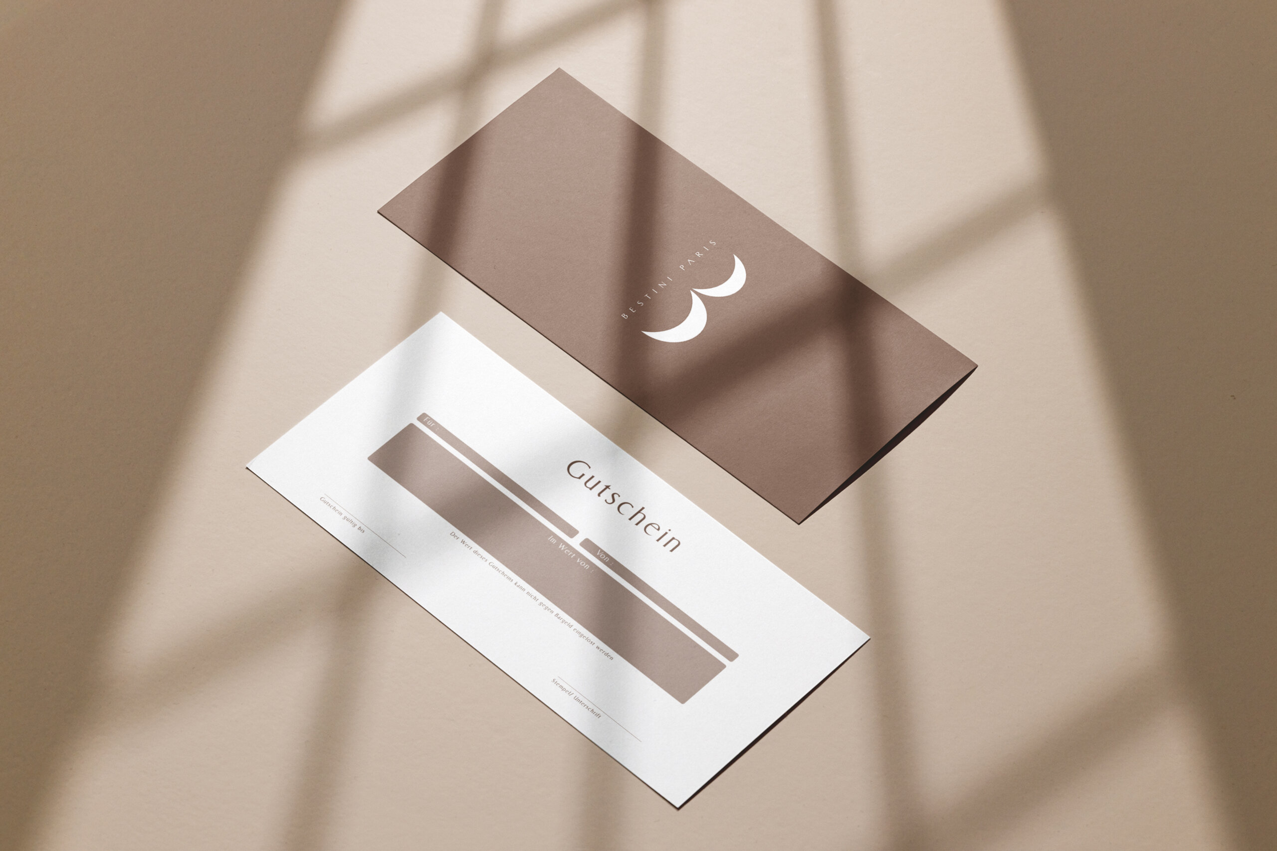
The use of crescents functions symbolically, conveying balance, flow, and contemporary luxury, while the clean, vertical line of the “B” provides structure, stability, and visual impact.
The result is a minimal, premium, and versatile logo, designed to adapt seamlessly across different media and applications, consistently reinforcing the brand’s identity.