PROJECT DETAILS

Design: Deki Studio  Design

Project: Wide Horizons

Project date: November 2025

Project location: Athens

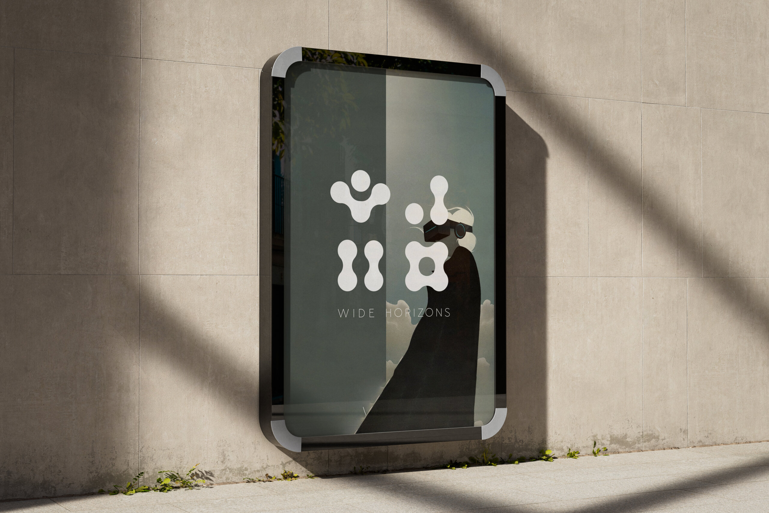
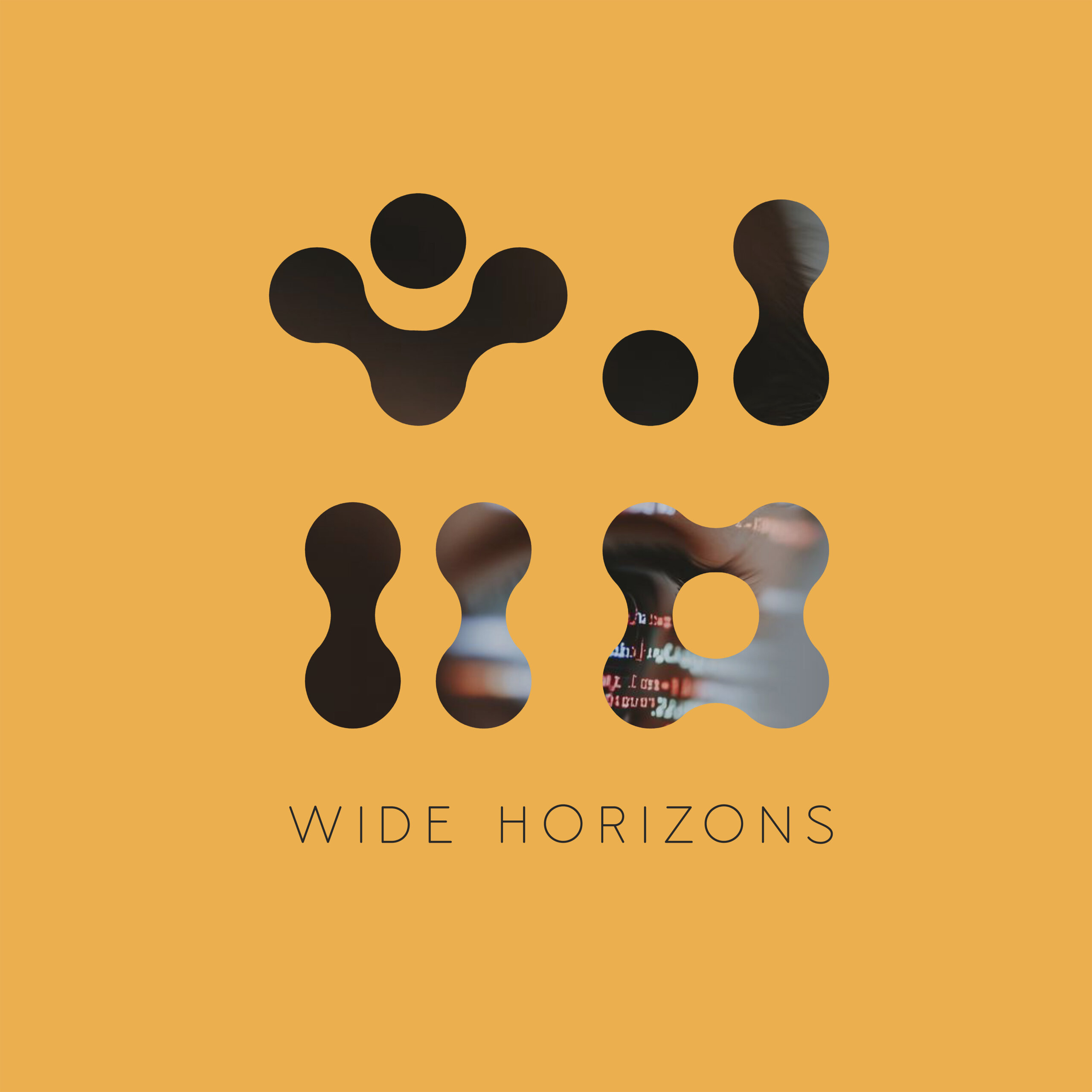
The Wide Horizons logo was designed as a flexible and evolving visual system that reflects the philosophy and methodology of the organization. Rather than functioning as a static symbol, it is conceived as a form that can transform, adapt, and be redefined according to the context of each activity, educational program, or social group. Wide Horizons is a non-governmental organization operating in the field of interactive entertainment and education, focusing on vulnerable social groups such as inmates in correctional facilities and children with special needs. Through experiential tools, play, and participatory activities, the organization seeks to open new horizons of thought, expression, and social inclusion for individuals who are often excluded from creative and educational opportunities.

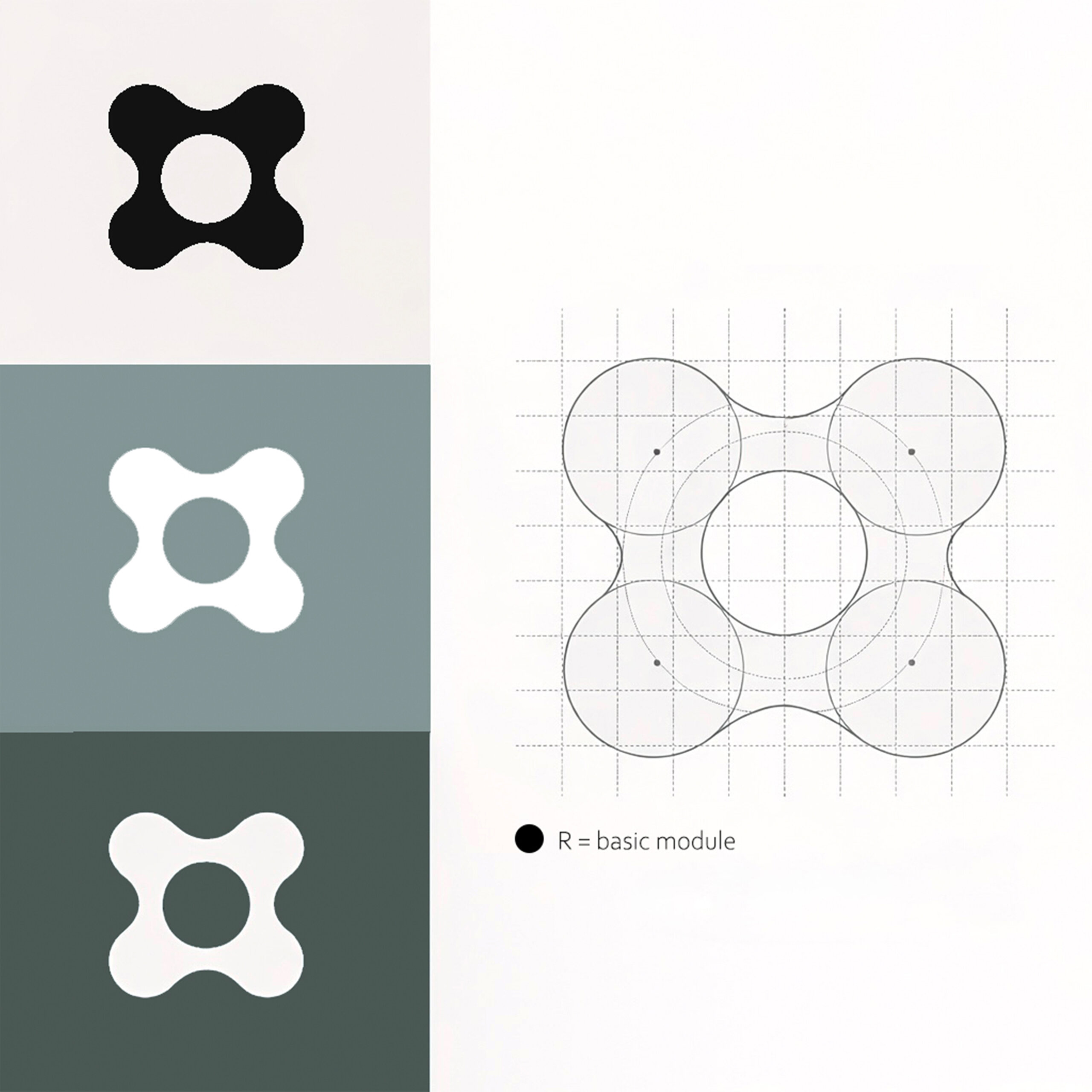
The starting point of the design is the circle—the most fundamental and universal geometric form. The circle symbolizes the individual, equality, participation, and the sense of belonging. Through its “playful” interaction connection, overlap, and repetition, multiple forms emerge, functioning as visual metaphors for interactivity and collective experience.

The logo is structured through a modular logic, allowing the deconstruction and recomposition of its core elements. Each variation can incorporate the specific conditions of a given context: the audience, the environment, the theme, or the purpose of the activity. In this way, the visual identity does not operate as something fixed, but as an open system of participation, much like the activities of Wide Horizons themselves. 

The organic connections between the circles generate shapes that evoke human figures, relationships, and networks, emphasizing the social nature of the organization. The softness of the curves and the absence of sharp angles express care, acceptance, and respect for the vulnerable communities with whom Wide Horizons collaborates.

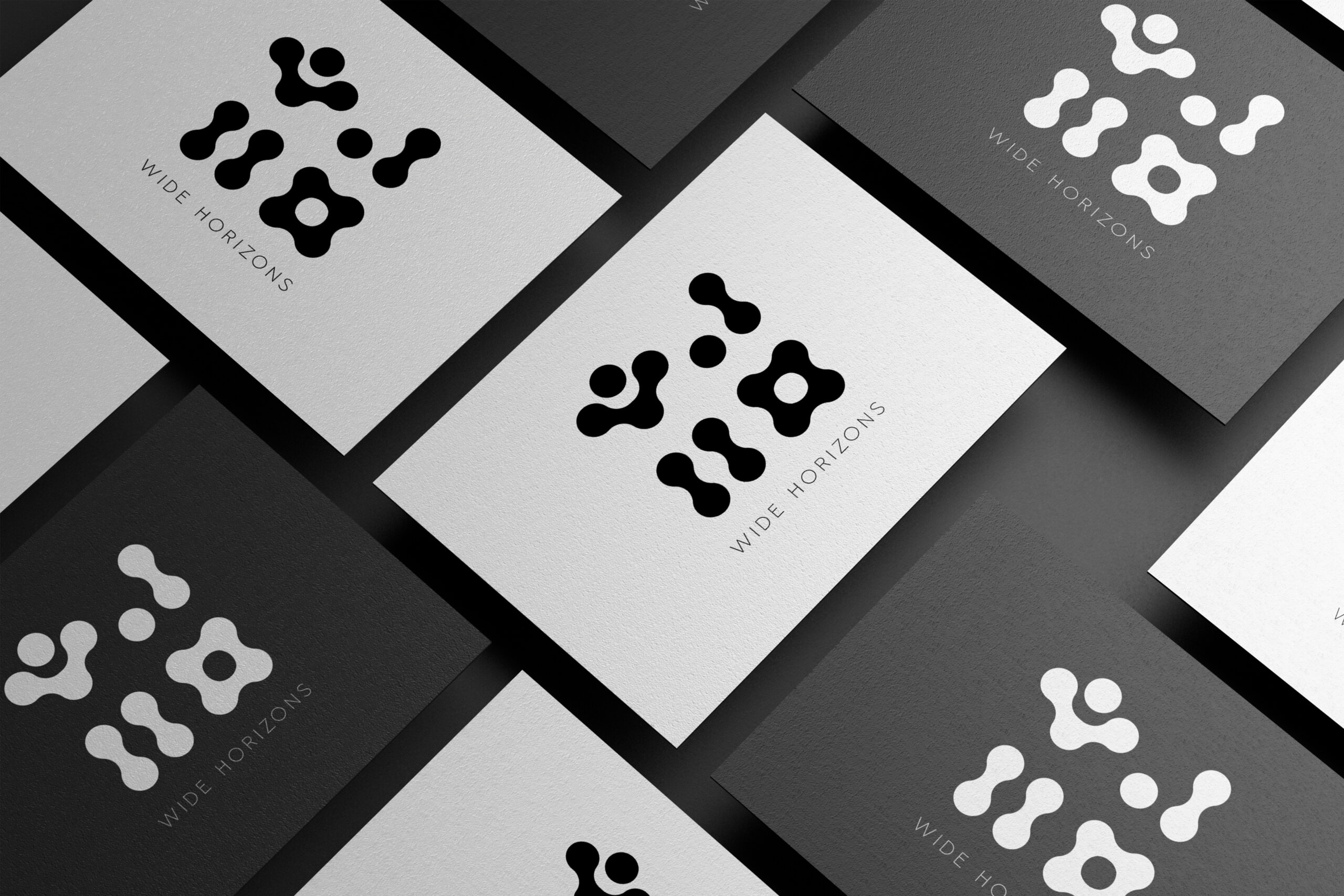
From a graphic design perspective, the logo functions as a visual platform that allows freedom in applications, color variations, and formal experimentation without losing coherence or recognizability. This flexibility reflects the organization’s social role: every individual is different, every experience is unique, yet everyone deserves space for creation, learning, and expression. The Wide Horizons logo does not simply represent an identity; it acts as a tool for communication and empowerment, a symbol that adapts, evolves, and coexists with the people for whom it was designed. In this way, the visual identity becomes part of the experience itself rather than merely its description opening, like the organization, wider horizons.