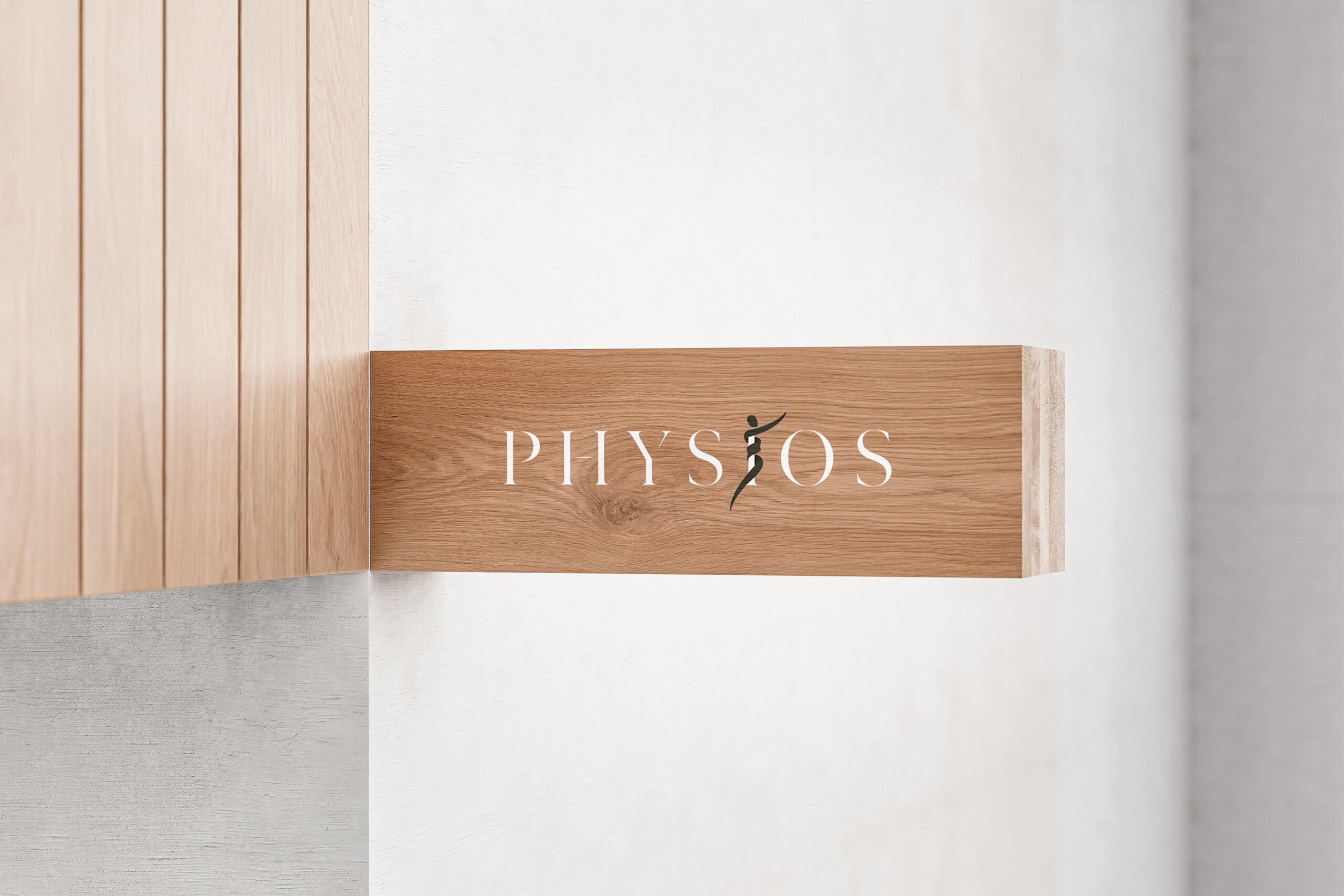
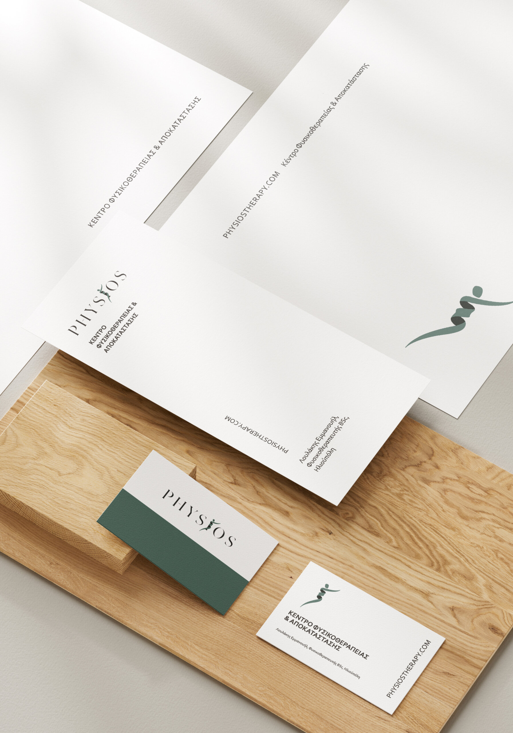
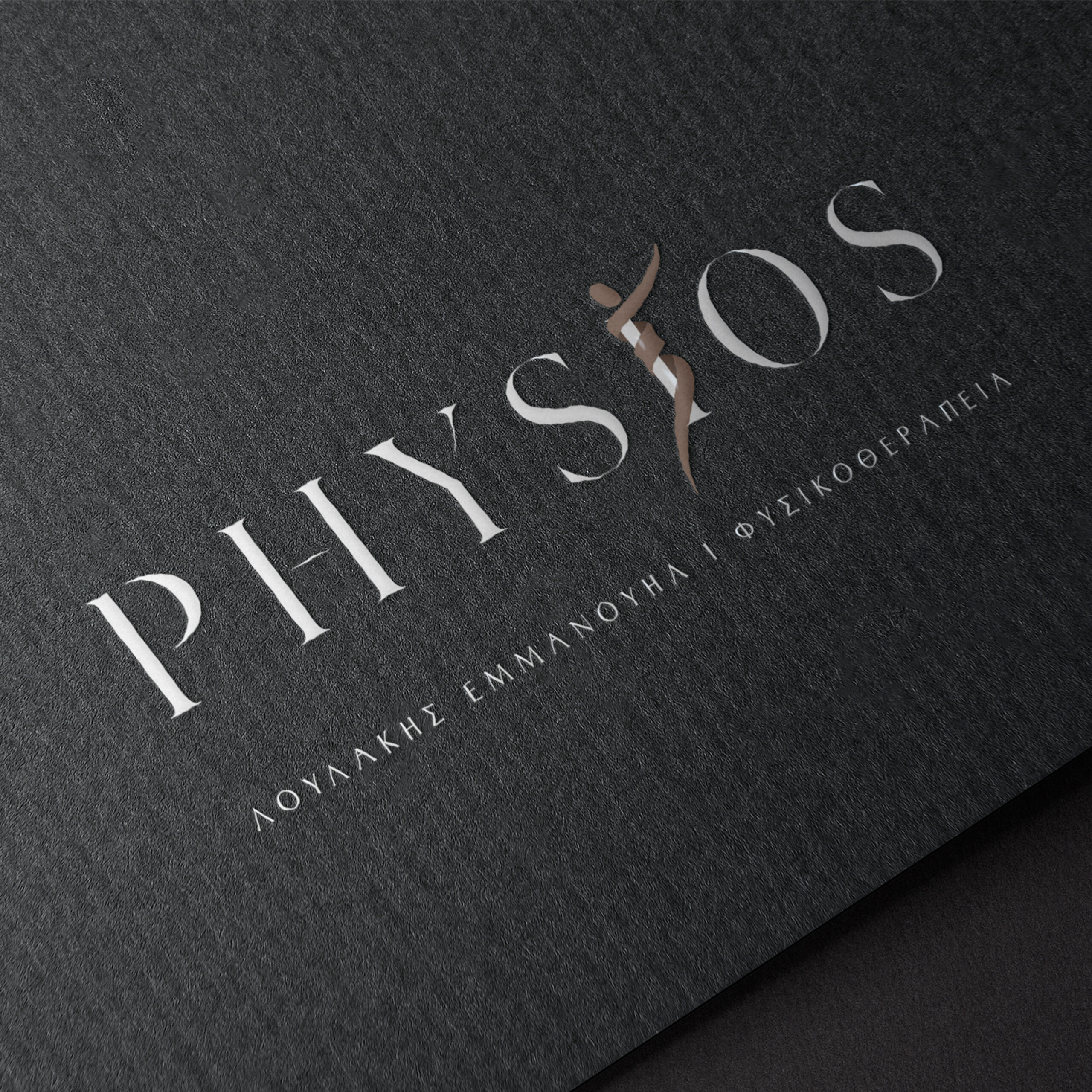
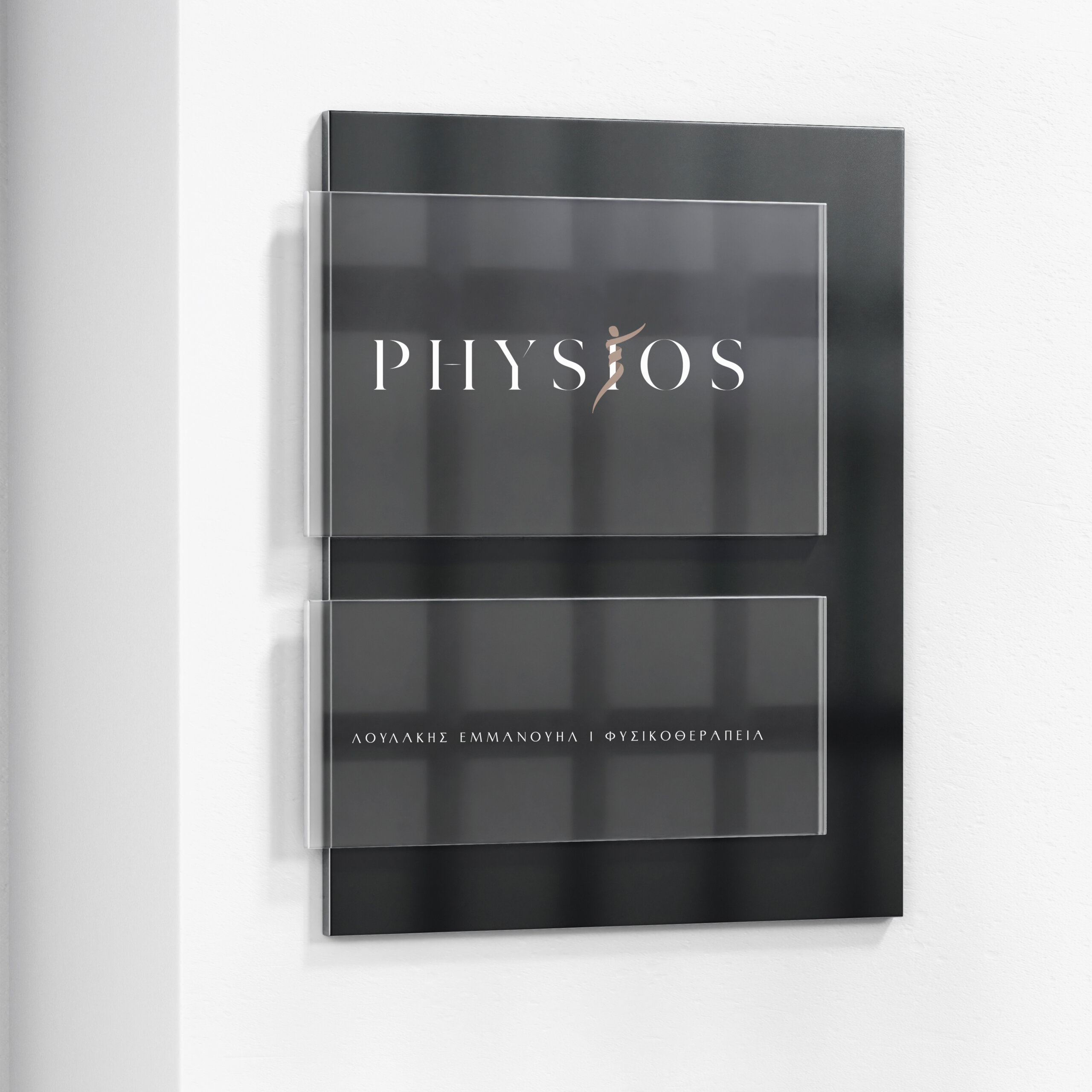
The custom typography was developed with an emphasis on balanced proportions, rhythm, and clarity of line, conveying professionalism, stability, and a sense of care. The lettering frames the symbol and establishes a unified visual axis, within which the mark integrates organically rather than appearing as a detached element.